01
Helix captures the workout
Court sensors, a sensor-enabled ball, and a player sensor record shooting activity automatically.

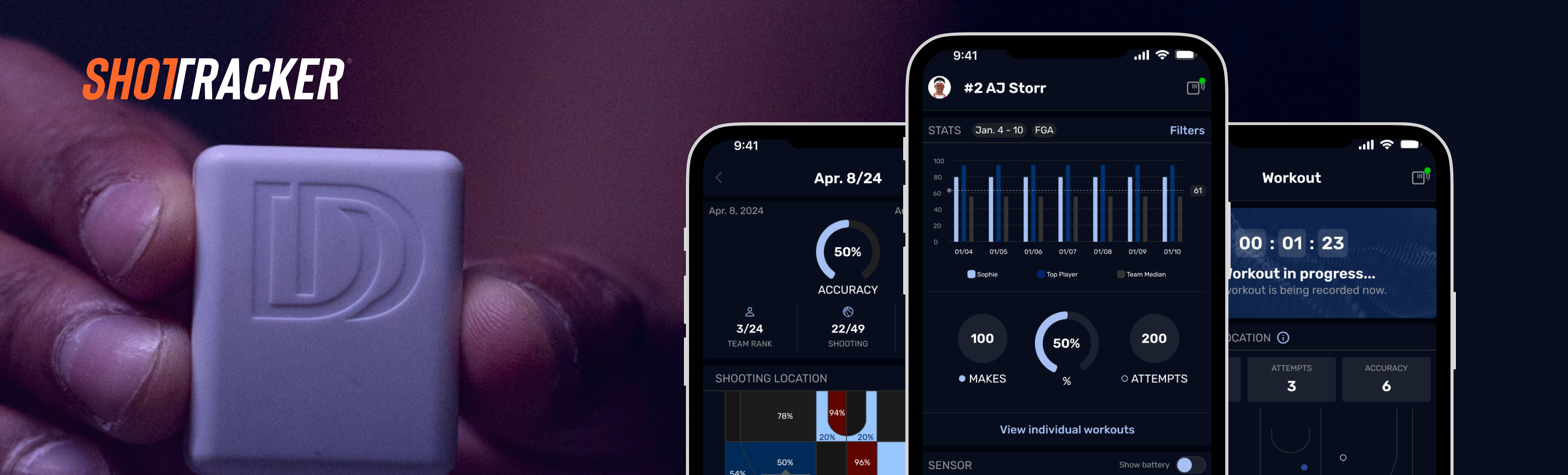
ShotTracker Go is the player-facing mobile app within Helix. The MVP gave athletes the freedom to train whenever they wanted in their school’s gym, see shooting stats immediately, and compare their performance with the team’s top player and median.
How ShotTracker Go Works
01
Court sensors, a sensor-enabled ball, and a player sensor record shooting activity automatically.
02
Athletes can start their own workout whenever they have access to the school gym, without waiting for a coach-led session.
03
Personalized dashboards show immediate results and compare each athlete with the team’s top performer and median.
Design Challenge
01
The legacy app no longer supported current player needs, so athletes often depended on coach-owned iPads or team staff to understand their own performance data.
02
Players needed a personal way to train on their own time, see results immediately, and understand their performance in the context of the team.
03
Before I joined, Helix let coaches choose any color in response to client requests for team branding. That color was applied as one tone throughout the app, creating inconsistent results and combinations that could fail accessibility standards.
Key Product Decisions
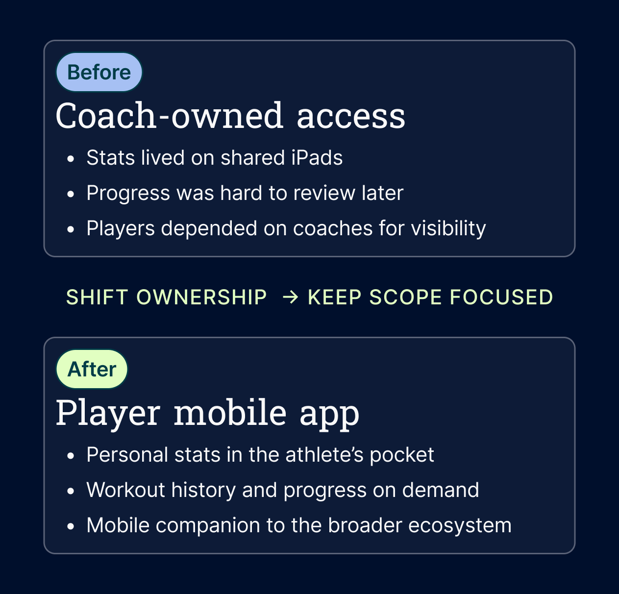
Decision 01
I designed Go around athlete autonomy rather than shrinking a coach workflow onto a phone. Players could start workouts on their own, review progress, and understand how their results compared with the team’s top player and median.
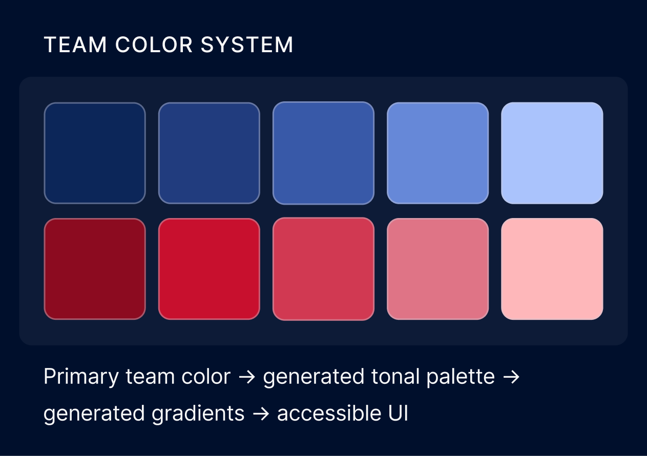
Decision 02
I replaced open-ended color selection with a governed system. Engineering would configure each school’s official primary color in the backend, removing choices that could create poor contrast. The interface would then generate the approved tones, gradients, and opacity values it needed automatically. This preserved the team identity clients wanted while keeping the experience consistent and accessible. I added these foundations to the shared design library so Go stayed cohesive with Helix and other ShotTracker products.
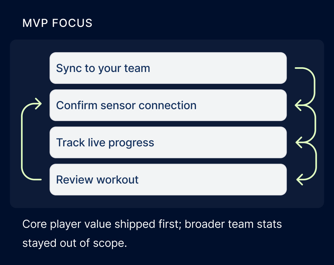
Decision 03
The account and sensor architecture was complex, so I kept the first version centered on what players needed most: join their team, confirm their sensor connection, start a workout, see live stats, and review their performance. Coach-assigned workouts were planned for Phase 2.
Team branding demo
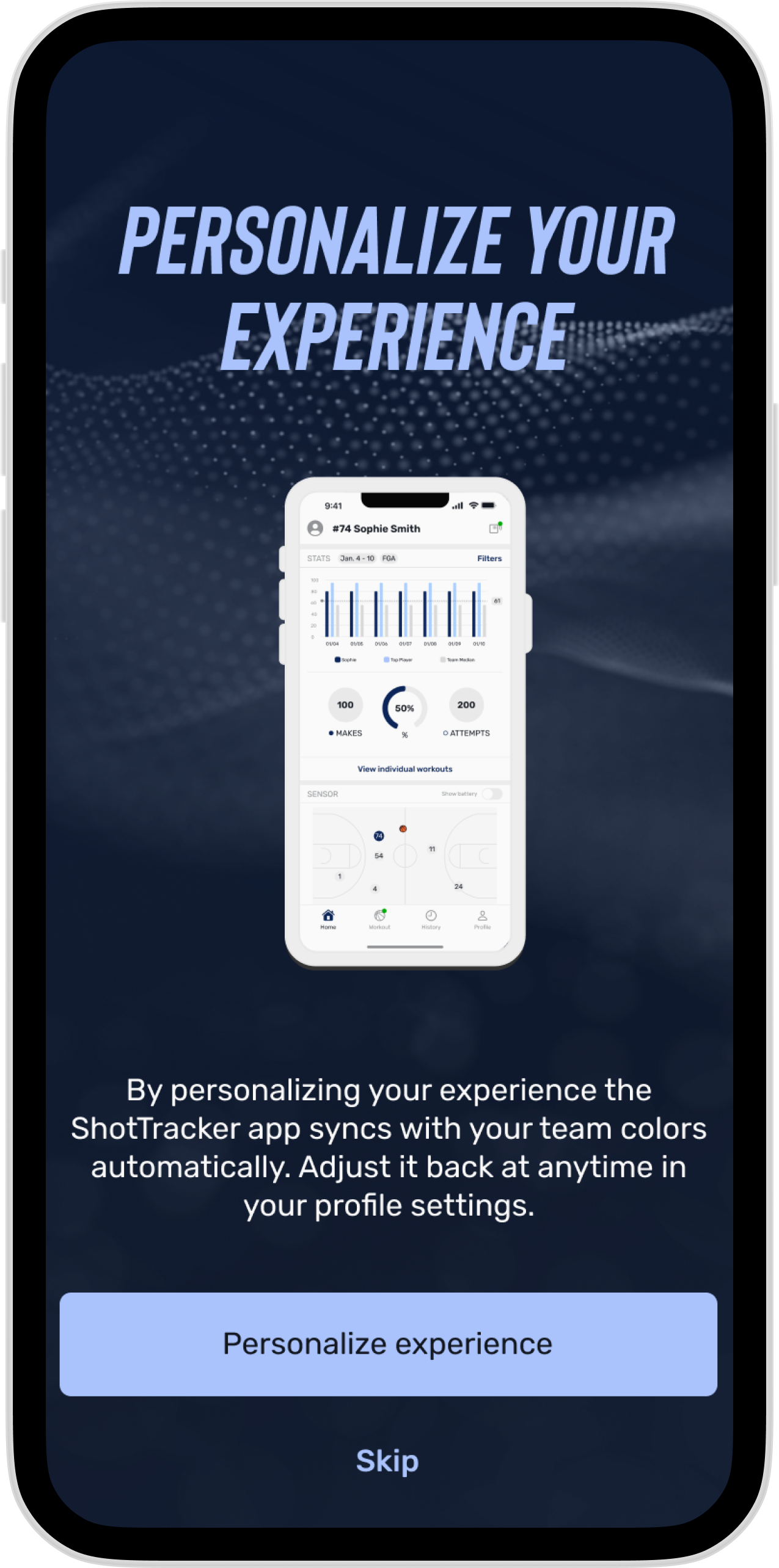
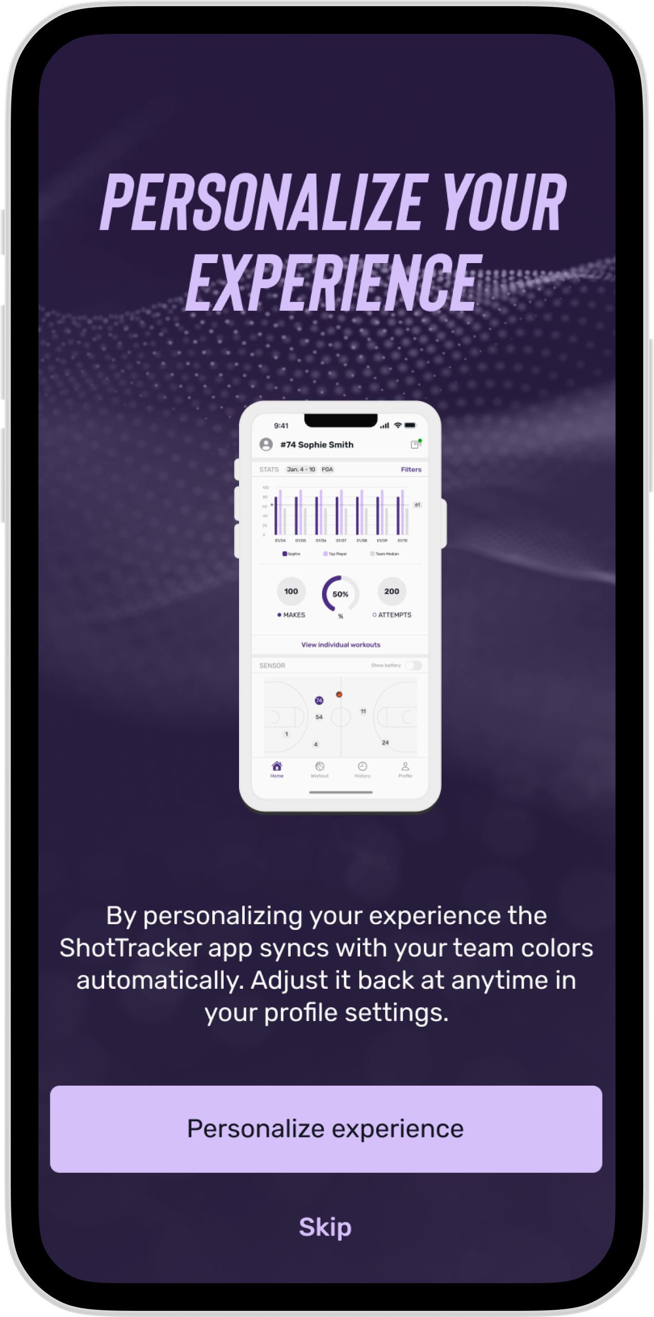
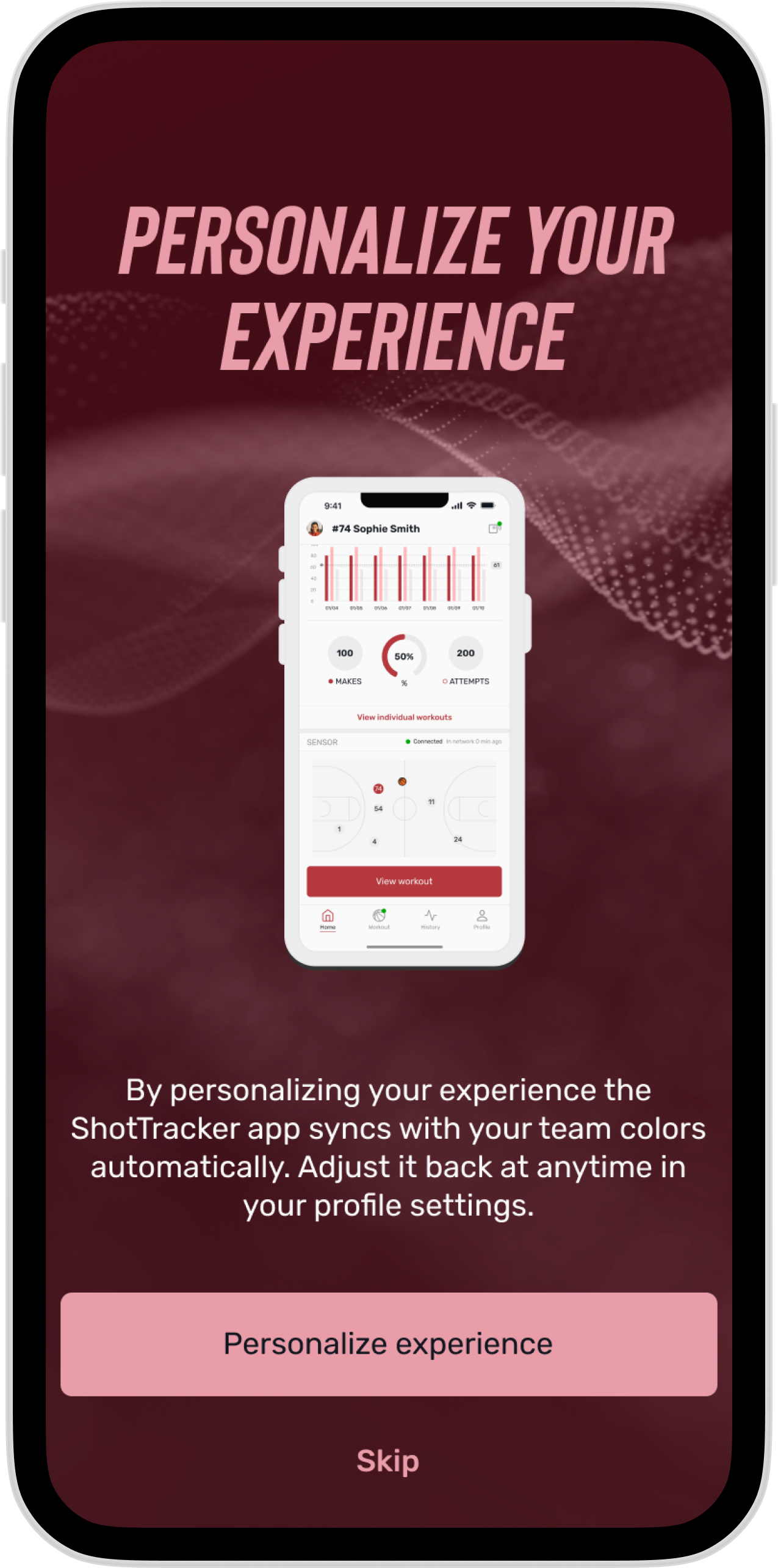
Select an official team identity and the app applies an accessible, consistent color system automatically.
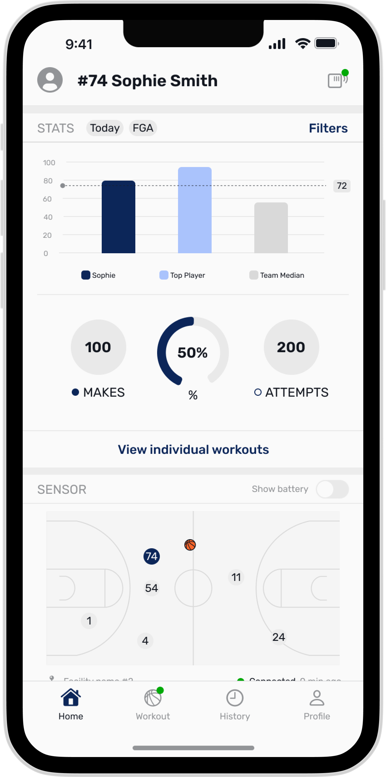
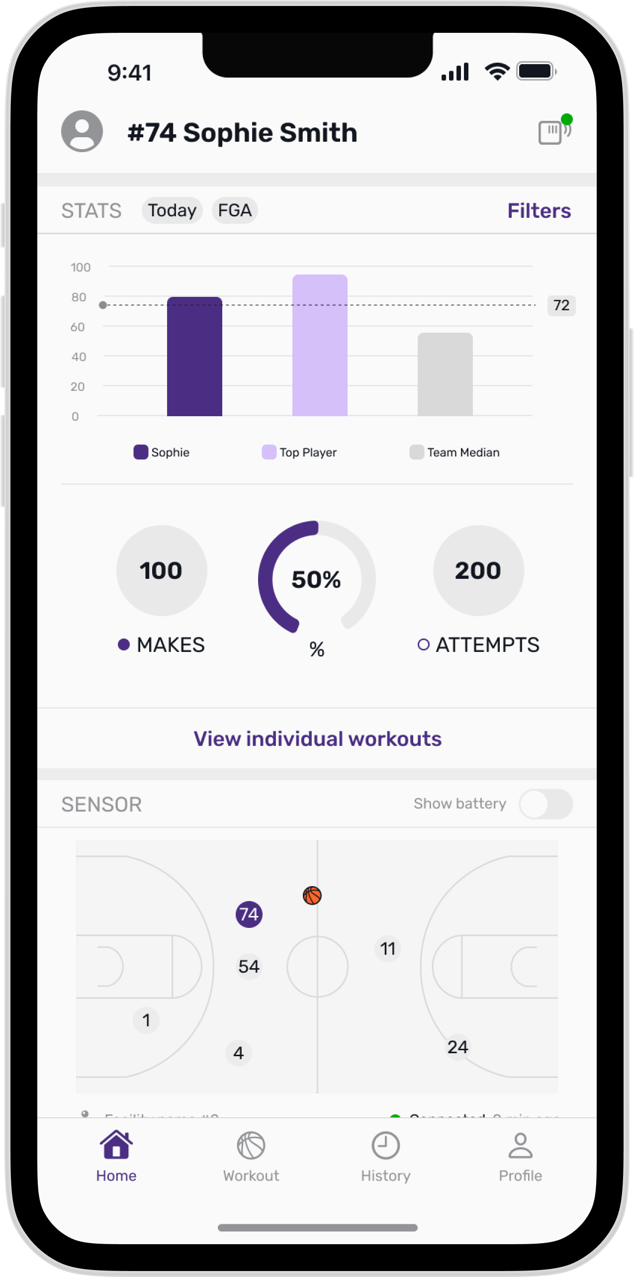
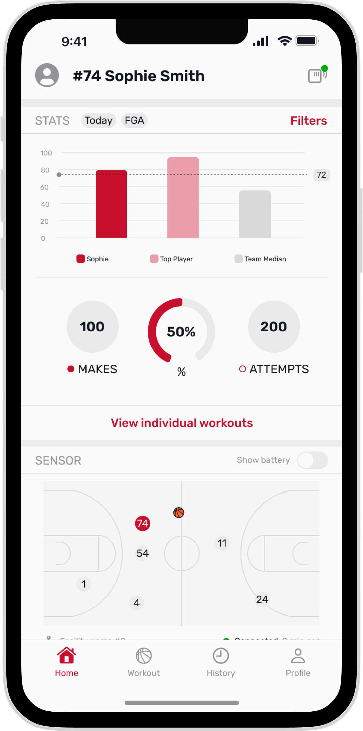
Review completed workouts, performance stats, and team comparisons in one place.
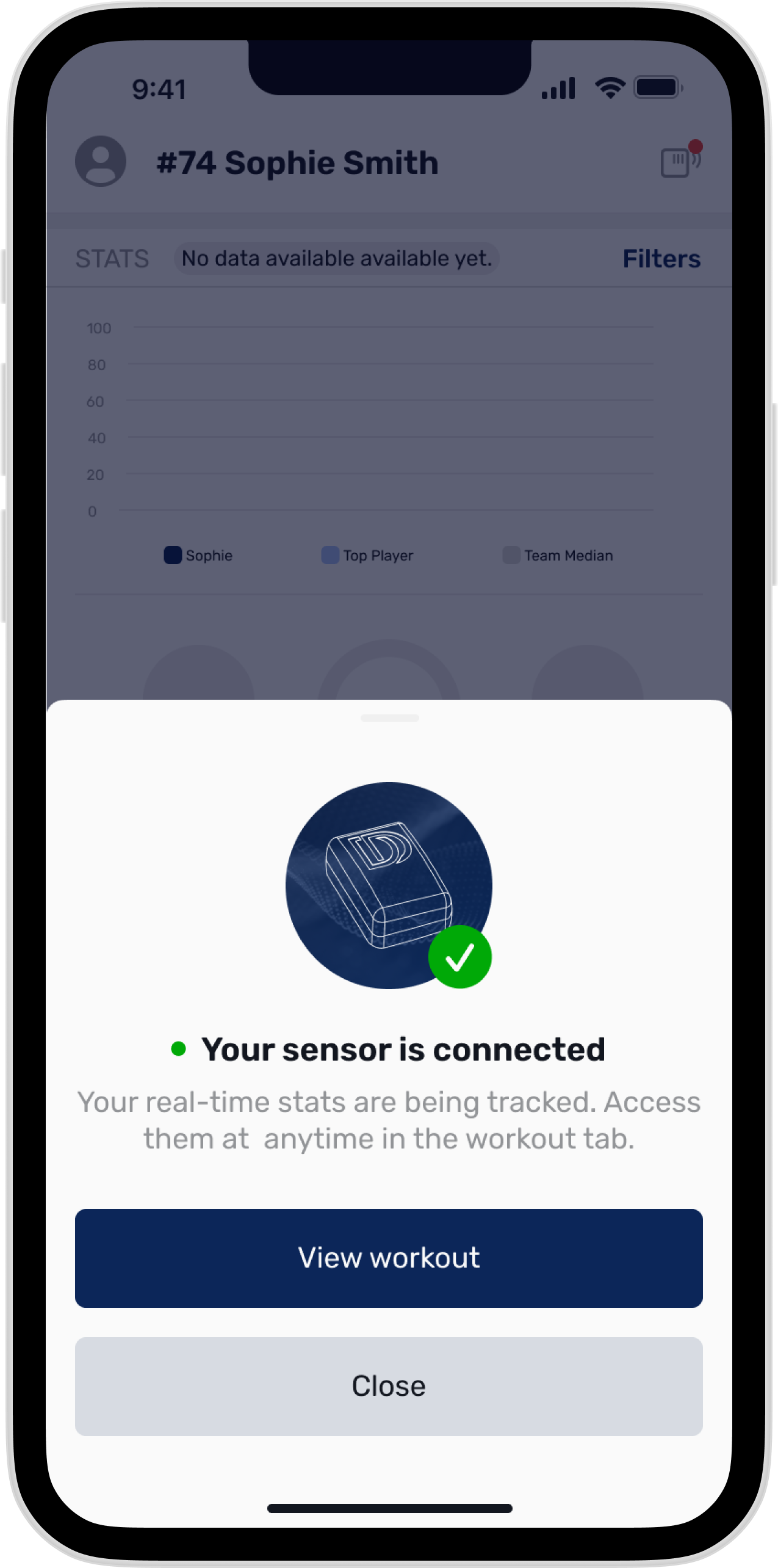
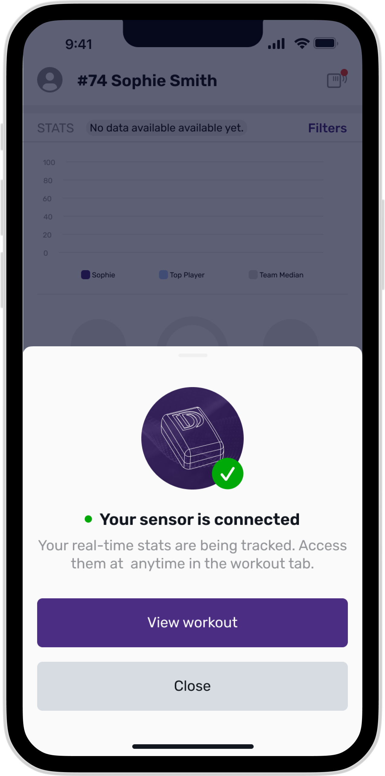
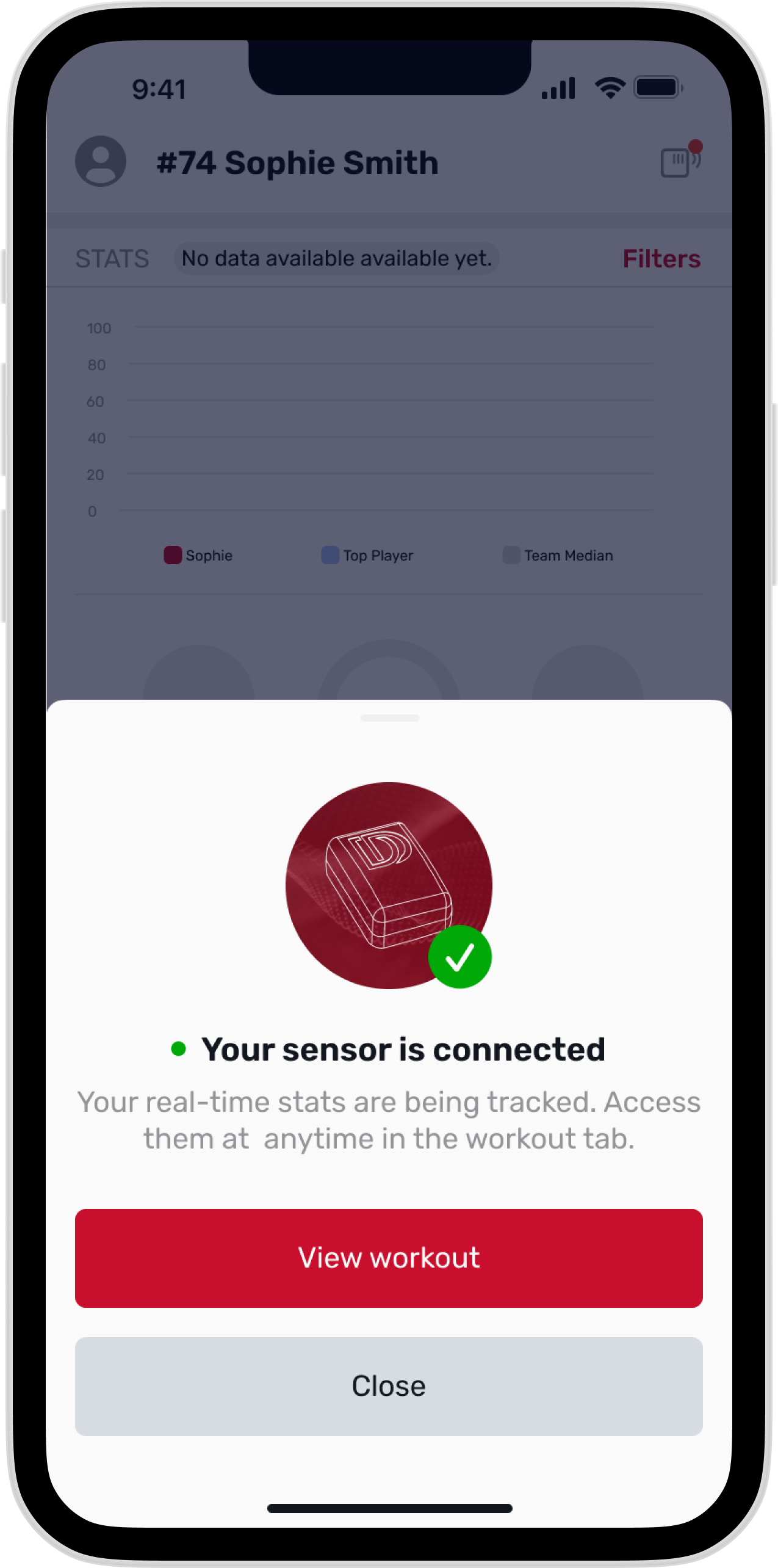
Confirm the player sensor is connected before training so Helix can capture the workout.
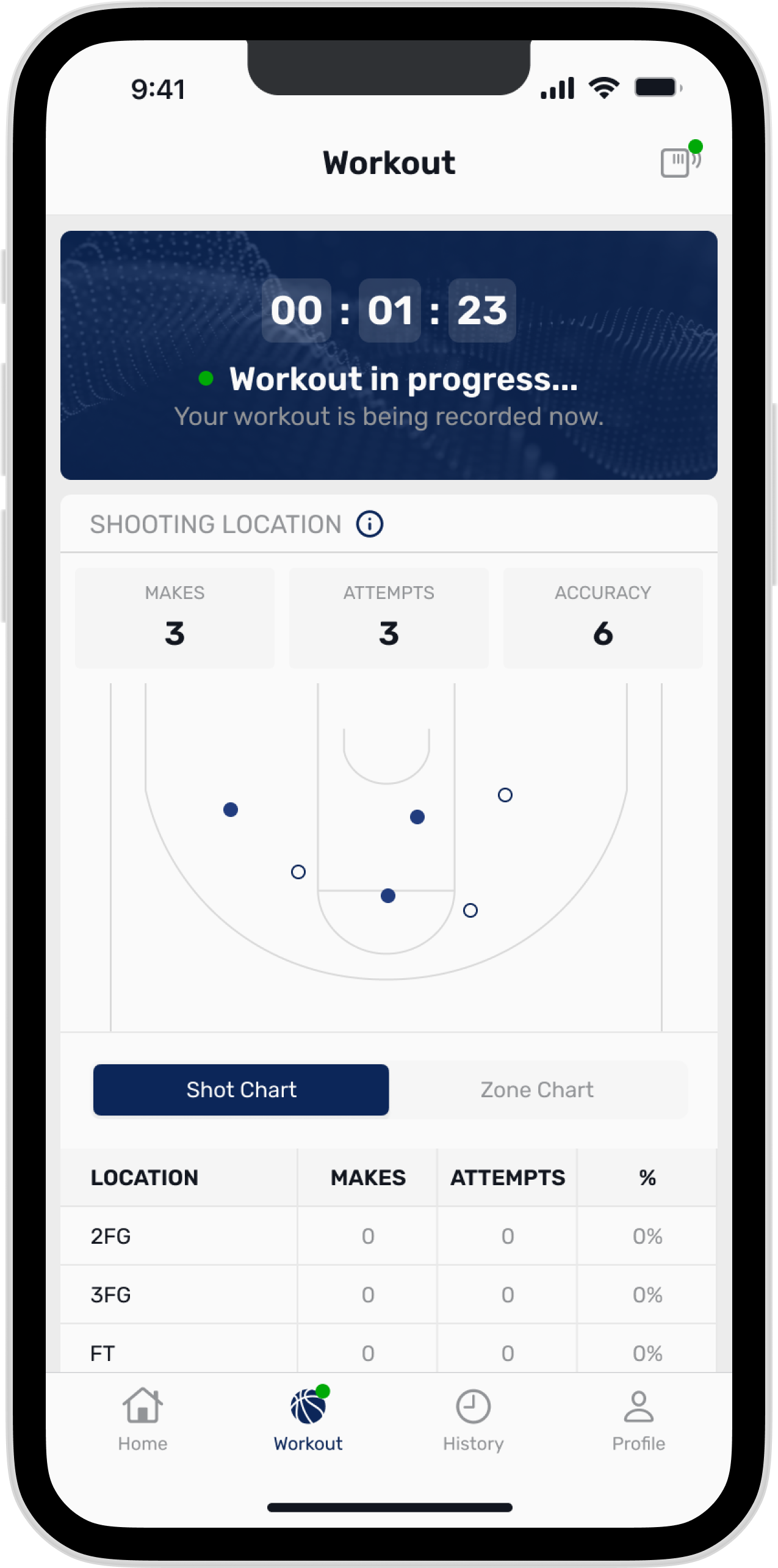
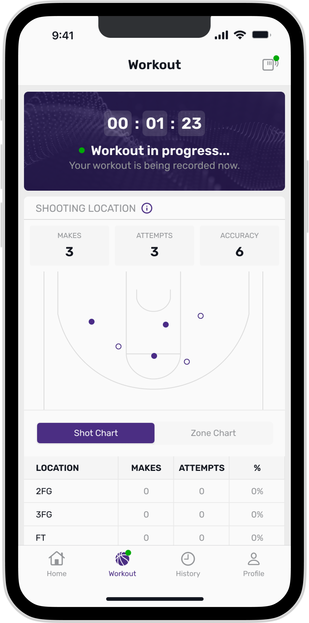
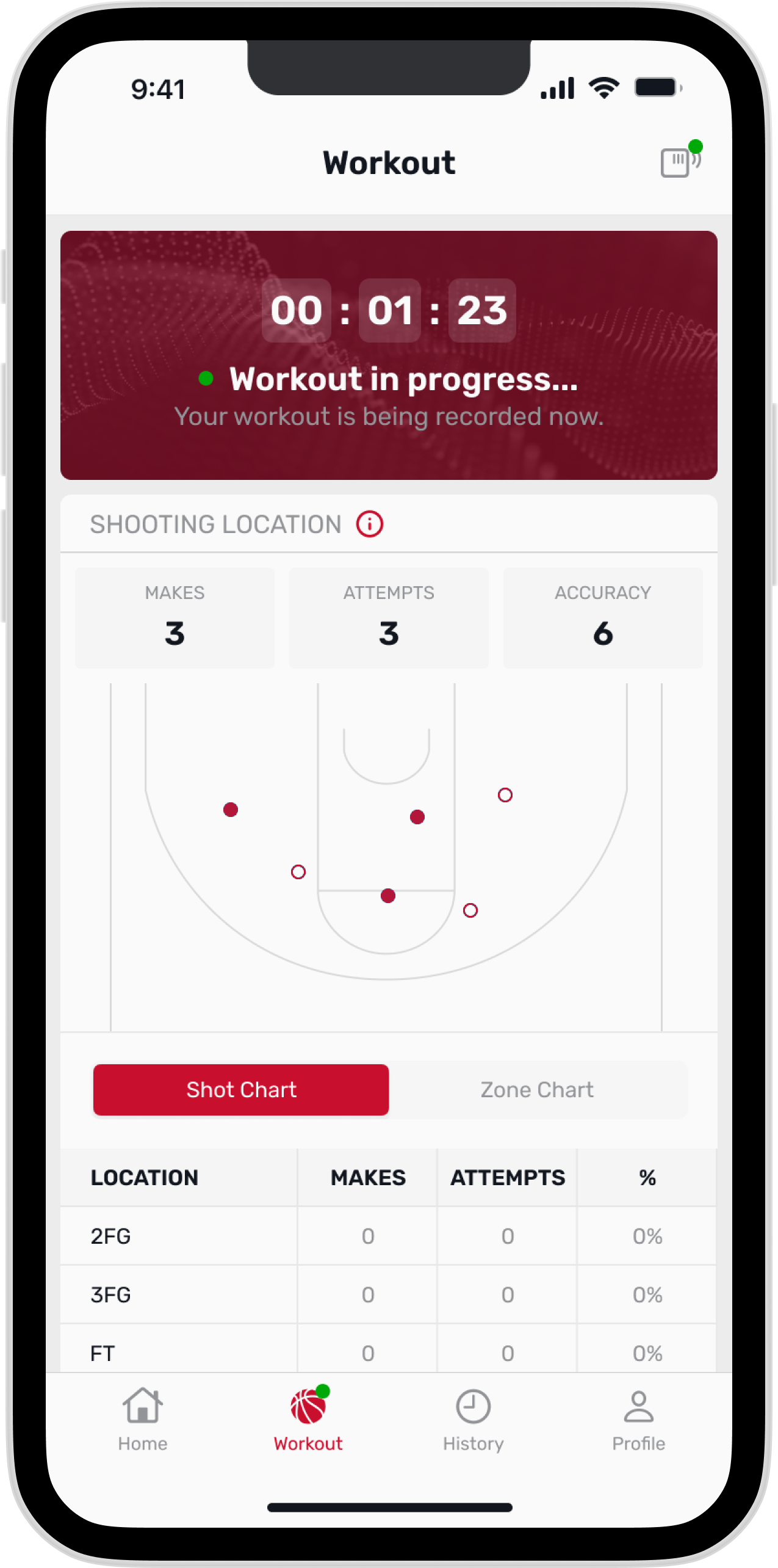
See shot and zone charts update in real time while training.
Key Decisions
The core design decision was user ownership. Players were not a smaller version of coaches; they had different motivations and moments of use. I focused the MVP on giving athletes direct access to self-directed training, immediate results, and meaningful team comparisons. Coach-assigned workouts remained part of the Phase 2 roadmap.
The team-color system became a product systems decision, not just a visual styling choice. I moved personalization from unrestricted coach selection to brand governance: engineering configured each school’s official primary color, and the interface derived the supporting tones, gradients, and opacity values automatically. That met the client need for team identity while reducing accessibility risk and making the approach scalable across many programs.
Reflection
This project reinforced how much the experience around data affects adoption. The legacy player app no longer supported current player needs, and the engineering team recommended rebuilding it. Even useful performance data can go unused when athletes cannot access or understand it easily.
The rebuild gave players a more independent way to train. Athletes could use their own phone to start a workout whenever they had access to the school gym, train individually or with a group, and see results immediately. Comparing their performance with the top player and team median gave those results useful context.
It also showed how systems thinking can make personalization feel custom without becoming fragile. The team-color model gave players a product that felt connected to their program while giving design and engineering a controlled, accessible framework that could be reused beyond the first release.
Outcomes
Players in testing said they’d likely use the app.
Player adoption rate in the first 3 months
Featured in University of Kansas Instagram promo video.
Launch Context
The mobile app was later shown in a promotional video with University of Kansas athlete AJ Storr, giving the product a real launch context beyond static screens.
I’m happy to walk through the full design process and decisions behind the product.
Contact me